Copyright 2009 Seattle Daily Photo. All rights reserved, including reproduction or republishing.
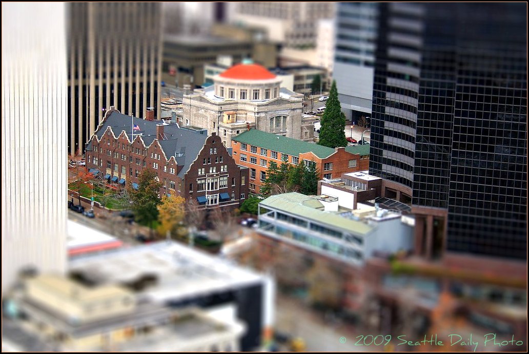
When I took this shot of downtown's historic Ranier Club and the round domed First United Methodist Church, they looked like miniatures nestled among giants. So I thought this tilt-shift treatment might be fun to emphasize the obvious. These landmark buildings will have a new neighbor of glass and steel next year right where the light colored brick building is: the 43 story Fifth & Columbia Tower. It will be multifaceted and smallest at its base (a concept seen in yesterday's photo) to help these historic buildings maintain some sense of space around them. (See this amazing design here and this exact view two years from now here.)
14 comments:
Wow. I really like the scene as you shot it and the scale of the buildings there now. No matter what they do to make the new building fit in, the difference is going to be monumental. If I owned the small buildings I would be selling now.
I absolutely ADORE this photo treatment. It makes the city look like someone built a miniature version of it.
Can you share how you did that?
Wow, the tilt-shift works great here.
OMG at first I thought you meant they were going to demolish these lovely doll's house!
The photo is stunning.
Abe. Thanks. And the church did sell their building to the developer last year. He is leaving the structure but converting its use--more in the linked articles. Being across the street from the city's tallest building is going to make the forest of tall structures pretty dense.
-Kim
Thanks D, S, & C! The little free effect program can be found at tiltshiftmaker.com. It is very limited in function and not like an actual tilt-shift lens, but fun to play with none the less.
-kim
Nice effect, This effect definitely works better from a high vantage point. I've replicated this effect in Photoshop, no special software needed, just a layer mask, a little blurring and levels to make the building look "model-like."
I just realized I said no special software needed, but Photoshop is pretty special, and if I didn't have it at work, I certainly wouldn't be using it.
Great photo! I love the tilt-shift effect.
Clueless in Boston, I don't use photoshop for post processing, so the little fun site Shawn (Slightlynorth our guest photog from a few weeks ago) showed me was a great way to go for me. Now, if I could afford a tilt-shift lens, I'd be trying to learn how to do the kinds of architectural shots they are intended for. The miniature seems like a novelty side effect, but if used sparingly could create some amazing images. . .like the one in a national magazine I saw of the presidential inauguration. It was a great shot, not just a novelty. One of these days I'm going to have to try editing a few images on my husband's laptop, which has Photoshop (he was a designer and used it and AutoCAD in his work). But, the program is so large and so intimidating, I just don't have the time to teach myself right now.
-Kim
Thanks for the tip, Kim!
I was trying to see if we will see it on your banner's picture... but did not mange to find the answer!
MN, Yes, it is just to the left of the Space Needle in my banner photo. Thanks for asking.
-Kim
Fun. It makes it look like Mr. Roger's neighborhood. :)
Amazing shot!
Post a Comment