Photo & Text Copyright 2008 Seattle Daily Photo. All rights reserved, including reproduction or republishing.
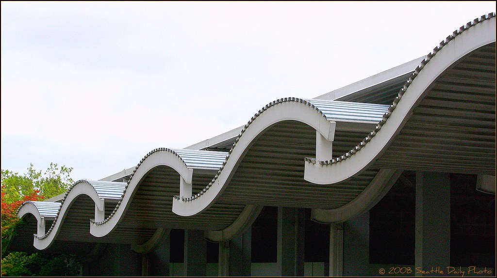
Like a rolling sea, 50s and 60s architectural details took curves and angles and worked them into almost everything. Of course, so did the deco period, but in a different, less "space age" way. This portico is at Seattle Center. Tomorrow, another related photo. Happy Friday everyone!
5 comments:
What a great roof. Must be interesting to see how it works in rain. I can't see guttering from the curved parts.
I really like this roof line.
I enjoy the pattern made by this roofline.
It looks like they took a simple opportunity to have some fun.
Speaking of fun! Have all you CDP bloggers voted for your choice of theme for January?! With us, voting is so fun, you get to do it every month! Come on around to the special member's area of the CDP portal forum...
A splendid idea, the related photos series. I'm looking forward to the others. This roof is quite interesting. I'm not sure I would have thought "space age freaky 60s" when looking at it, but I certainly see it now! Very artistic shot. I love how the wave of the roof line directs your eye to the fall foliage at the end.
Post a Comment